
Ben Shaw
Meet vykee: A Userpilot Alternative Built Into Your Product

If your SaaS onboarding feels overly complex, it’s probably not your fault.
As your product evolves, complexity creeps in: new features, enterprise requirements, edge-case workflows. Before long, what was once intuitive now demands an explanation. That’s when teams reach for solutions like Userpilot to guide new users with tooltips, slideouts, modals, and checklists.
And sure, these tools help – temporarily. They walk users through the maze. But they don’t change the fact that the maze exists.
vykee starts from a different premise – a lightweight, behavior-driven Userpilot alternative that meets users where they are.
Please note that this comparison is based on publicly available information and our understanding of typical SaaS use cases. Since product offerings may change over time, we recommend exploring both options hands-on to see which one aligns best with your goals. :)
What Userpilot does well
Userpilot helps teams ship onboarding flows quickly without relying on engineering. You can define in-app tours, modals, and contextual nudges, all triggered by user actions or profile data.
That’s great for:
Introducing new users to key features
Highlighting changes or updates
Personalizing experiences based on segments
It’s especially useful when your UI is mature, relatively fixed, and just needs a little help steering people toward value.
But there's a deeper truth product teams often overlook:
If your interface is confusing without a tour, a tooltip won’t fix it – it’ll just explain it.
What’s really standing in your users’ way
Most onboarding tools assume the issue is knowledge: “If users just knew what to click, they’d be fine.”
But most friction isn't about knowledge. It's about cognitive overload.
When users open your product and see a dense interface with ten competing actions, their brain stalls. Even if every feature is technically useful, the sum total can feel paralyzing.
This is where some teams may find traditional onboarding tools, including Userpilot, less effective for addressing underlying UI complexity. Its model assumes a static UI and overlays guidance on top of it. But that guidance – modals, tooltips, slide outs, checklists – is still part of the interface. For certain use cases, overlays can contribute to information overload, instead of reducing it.
vykee takes the opposite approach. It simplifies the product itself, offering a leaner, more adaptable alternative to Userpilot for teams looking to reduce UI friction.
Onboarding that grows with the user
vykee is built around a core principle: Simplicity retains.
Instead of assuming every user needs to see everything at once, vykee shows only what matters right now. The interface begins in Simple Mode – a minimal view containing only the essential actions required to reach activation.
As users engage with the product, vykee unlocks features progressively, based on what they do – not what segment they’re in.
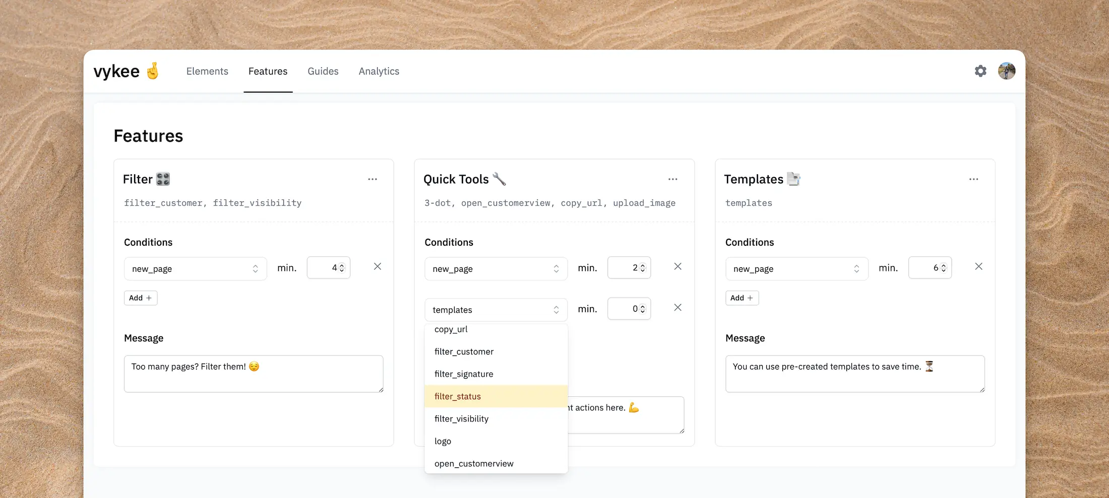
This concept (“progressive disclosure”) is common in UX design, but hard to implement at scale. vykee makes it easy, by letting teams tag UI elements and define simple behavior-based rules to control what appears and when.
The result is a product that feels intuitive and uncluttered, even as it becomes more powerful over time. It’s an approach that makes vykee a natural Userpilot alternative for products prioritizing clarity over instruction.
A different philosophy on onboarding
Most product onboarding tools on the market today – including well-established options like Userpilot – share a common model: they add guidance layers on top of your existing UI. Think product tours, checklists, and tooltips triggered by user segments or defined flows.
vykee offers a different approach.
Instead of layering instructions over complexity, it reduces the complexity itself. The product becomes the guide – not through overlays, but through a dynamic UI that responds to what users actually do.
It’s this foundational difference that makes vykee an attractive Userpilot alternative for teams rethinking how onboarding should feel.
Here’s how the philosophies diverge:
Traditional tools … | vykee … |
|---|---|
add guidance on top of your interface | adapts the interface itself |
rely on predefined onboarding flows | responds in real time to what users actually do |
require regular upkeep of flows and segments | runs on simple behavioral logic with minimal maintenance |
assume users need instruction | assumes users need clarity – and delivers it by showing less at first |
If traditional tools are like a chef explaining the whole recipe before you start cooking, vykee is like a magic kitchen – one that reveals only the tools and ingredients you need for the next step.
Why flow logic needs to evolve with the user
Userpilot lets you define different journeys for different users. A first-time user might see a welcome modal. A trial user might get a checklist. A power user might get feature nudges.
But these journeys are predefined. This model can work well, especially when your user segments are clearly defined and predictable.
But in fast-evolving products or cases where user behavior doesn’t always follow a neat pattern, these rule-based journeys can sometimes struggle to keep up.
vykee takes a more adaptive approach. Rather than depending primarily on static flows, it responds to real-time user behavior, surfacing interface elements and features based on what the user is doing right now.
Yes, both systems rely on conditions, but the emphasis is different: vykee focuses on contextual behavior rather than preset sequences. For example, if a user starts editing content, vykee might reveal formatting tools at that moment, without needing a separate flow triggered days later.
The goal isn’t to replace flows altogether, but to shift from timeline-based logic to experience-based adaptation. It’s a more organic way to guide users without assuming every step needs a predefined response.
Rethinking what onboarding metrics should look like
Userpilot provides detailed analytics on flow completion, drop-off points, and interactions. It’s powerful – but could be more than some teams need.
vykee tracks what matters most: engagement with actual product features.
You can tag key interface elements – like a signup button or feature toggle – and instantly see how users interact with them, helping you understand not just where engagement stalls, but also when.
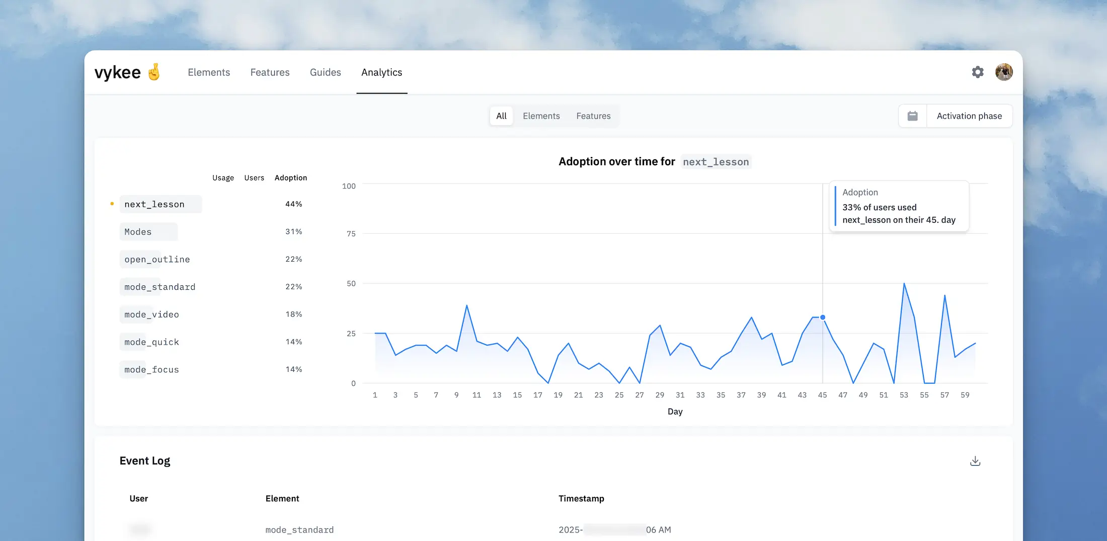
Because vykee looks at the entire activation phase – typically a user’s first 60 days – it helps teams pinpoint when key features are being used. This temporal view makes it easier to distinguish between features that are essential early on versus those that become more relevant later in the user journey.
You’re not simply measuring tooltip clicks. You’re measuring actual progress.
Light setup. Smart results.
Userpilot offers no-code onboarding features, which can be especially helpful for teams without engineering support. Still, depending on your setup, building and maintaining tailored experiences – like event-based triggers, segmentation, and UI targeting – could require thoughtful planning and time.
vykee keeps things simple. You add a lightweight script, tag the UI elements that matter, and define when they appear – all from a visual editor. No rigid flows. No complex segmentation rules to manage. The experience adapts based on real user behavior, not predefined personas.
Because vykee integrates directly with your product’s interface, you don’t need to manage multiple onboarding variants for different scenarios. The UI evolves naturally as users engage, so setup stays lean.
For teams looking for a light, adaptable Userpilot alternative, this shift toward behavior-driven UI can dramatically simplify onboarding.
Choosing the Right Onboarding Approach
Different tools work better depending on your product’s goals and complexity.
You might benefit from an onboarding platform like Userpilot if you:
Want to layer guidance on top of your product with checklists, tooltips and banners
Prefer predefined flows for consistent user experiences
Have a team to manage segmented journeys and onboarding content
vykee may suit your needs better if you:
Want the product to adapt in real time to user behavior
Are looking to reduce initial UI complexity through progressive disclosure
Value clarity and simplicity over layered instruction
If your product is already intuitive, Userpilot can help highlight specific elements.
If your product feels overwhelming at first glance, vykee offers a way to simplify and guide users more dynamically, making it a fitting alternative to Userpilot for teams prioritizing flexibility and product-led UX.
Stop teaching complexity. Start removing it.
Most onboarding assumes new users need to be taught.
But what if they just need to see less?
That’s the question vykee is built around. It doesn’t treat onboarding as a content problem, it treats it as a UX problem. And it solves it by making your product feel obvious from the start.
Userpilot adds instructions. vykee removes distractions.
Both methods can help users reach value – they just reflect different philosophies. We believe simplicity works better than explanation.
If you’re building a product designed for long-term growth, high activation, and low churn, don’t just guide your users. Support them by making the product work with their pace.
Looking for a modern Userpilot alternative that puts clarity before complexity? vykee lets your product do the onboarding. Quietly, intelligently, and only when needed.
Try vykee now ✨
Try it free